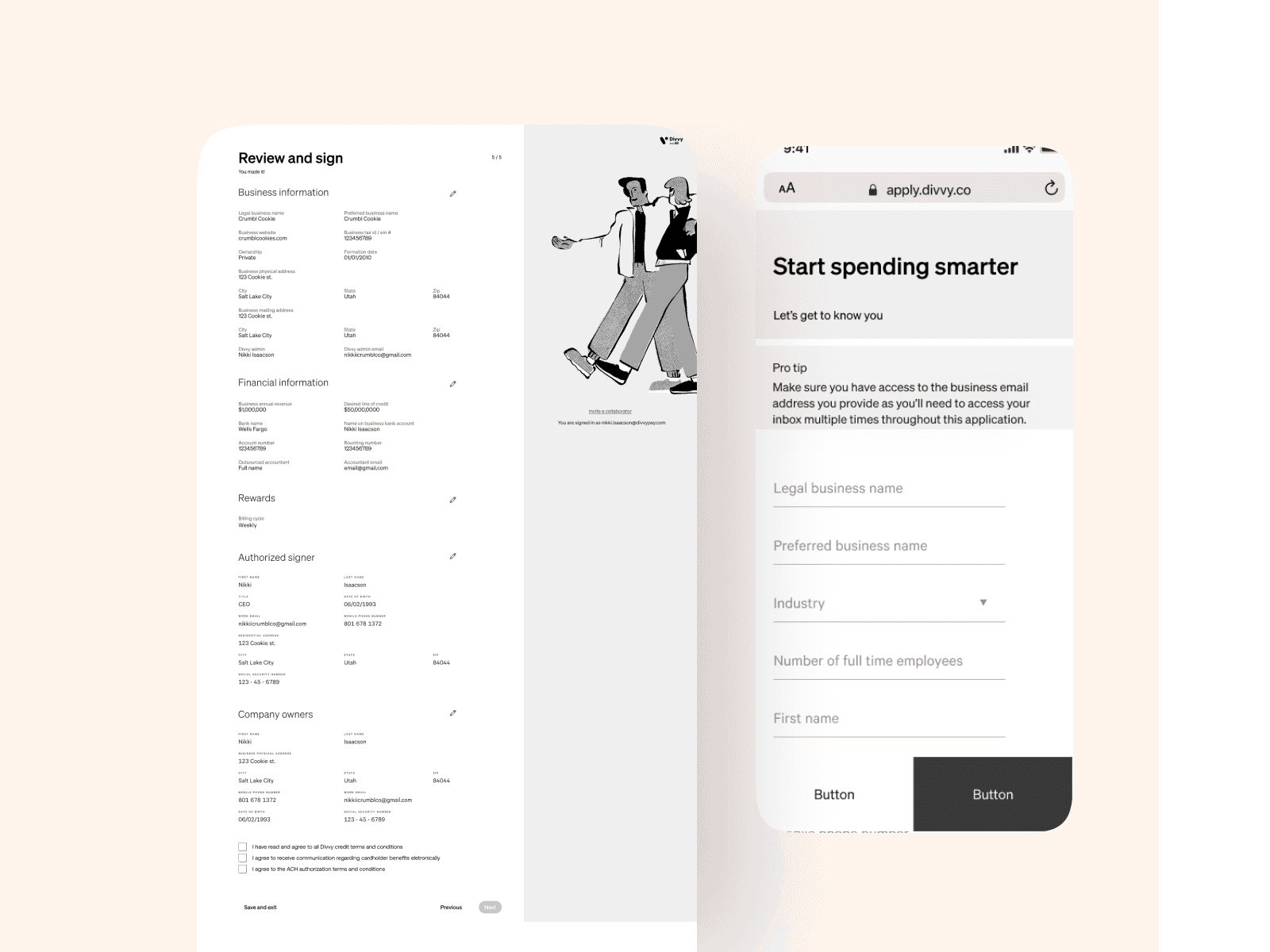
Divvy Onboarding | An Onboarding Revamp
OVERVIEW
How it all started
Over the past few months, I've been hyper-focused on revamping our application experience. While our Divvy/Bill product has received glowing reviews for its user experience and brand consistency, the same couldn't be said for our actual sign-up and onboarding flow.
Early warning signs emerged as we noticed increasingly troubling metrics around application completion and conversion rates. Support tickets regarding confusion were also piling up. To get to the root of the issues, I spearheaded a comprehensive research initiative, leaving no stone unturned.
We closely analyzed analytic platforms like Fullstory to dissect user recordings and funnels. I sat in on dozens of customer interviews to hear the pain points straight from the source. Our customer service teams provided a steady stream of real-world feedback they were receiving. We even watched customers attempt to complete the application for the first time via recorded sessions.
As I compiled and synthesized all of the qualitative and quantitative inputs, a clear set of major issues crystalized. While each pain point was significant in its own right, it was the cumulative experience that was undoubtedly hurting our business's growth trajectory.
THE PROBLEM
Rampant User Confusion: Our current flow is causing significant confusion on every single page. Users are getting lost, frustrated, and abandoning the process entirely. We have to simplify and clarify the entire experience.
Excessive Time Commitment: It's taking users roughly 7 minutes longer than competitors to complete our application. We're seeing a huge drop-off around the halfway point as people run out of patience. Streamlining and shortening this process is crucial.
Broken Brand Experience: The application looks and feels completely disconnected from our core Divvy/Bill product experience. Users don't feel like they're interacting with a secure, trustworthy part of our brand, undermining conversions.
Lack of Collaboration Features: The amount of personal and business info required is causing major bottlenecks. People need to pass the application to others but can't because of sensitivity around data like SSNs and addresses. We have to build in shared/delegated workflows.
Mobile Negligence: A staggering 60%+ of users are trying to apply on mobile, but we've completely neglected mobile UX here. This experience is absolutely broken on smaller screens and schemas. Adopting a mobile-first mindset is non-negotiable.
MEASURING SUCCESS
Fixing Foundational Metrics
Before diving into solutioning, we needed to define the core metrics that would determine success for this major redesign initiative. Improving the application experience was the goal, but how would we quantify and measure that improvement? I rallied the cross-functional team to align on a few key performance indicators.
Our North Star: Reducing Dropoff and Friction
Ultimately, the biggest indicator of a better experience would be increasing completion rates across the entire application funnel. We were seeing massive dropoff as users hit roadblocks and frustrations. By reducing points of friction, we could keep more users successfully moving through each step of the process.
THE IMPACT
As the saying goes, "the proof is in the pudding." Once we implemented these changes, we monitored and noted the differences in both overall and detailed step conversions between the old and new processes.
4% increase in approval rates
We're now approving 4% more credit applications, making it easier to get the financial support that is needed. With our enhanced process, more applications are successful.
We've streamlined our Divvy application process, resulting in a 30% reduction in completion time. This means you can apply more quickly and easily, saving valuable time.
This enhancement means a smoother, more accurate process for you, leading to fewer obstacles on your path to financial support.
This means more of our customers are finding it convenient and efficient to apply, getting everything done in a single go.
FAQ
What more do you need?
Is it true that you speak fluent user experience?
If a user falls in love with a design, do they live happily ever after?
How do you keep the 'user' in 'user experience'?
What’s your superpower in battling the chaos of bad design?


